Tech
Cagatay Ulusoy
Jun 1, 2023
Creating Responsive Layouts with Wolt Responsive Layout Grid: A CoffeeMaker Demo App
In the previous post, we had an introduction to the Wolt Responsive Layout Grid library and explained the technical implementation details of its components. In this post, we will demonstrate the power of the library in creating dynamic and adaptive layouts for the CoffeeMaker demo application.
About the CoffeeMaker Demo App
The CoffeeMaker demo application showcases a coffee ordering system in a store with two main states: online and offline. In the online state, users can browse through a dynamic and responsive screen that displays the coffee orders grouped according to their status and advance orders to the next step in the coffee-making process. The layout of this screen adapts seamlessly to different screen sizes, ensuring an optimal viewing experience on various devices. When the app is offline, it switches to a simplified screen that indicates the offline status. This screen also adjusts its centered content to different screen sizes, providing consistent visuals across various devices.
The CoffeeMaker demo app demonstrates the Wolt Responsive Layout Grid library in creating dynamic and adaptive layouts. Throughout the development of the CoffeeMaker app, code reuse, and composition were emphasized to promote code maintainability and reduce duplication. The centralized state management ensures a consistent user experience across small and large screens, simplifying state handling and promoting scalability.
With this brief overview of the CoffeeMaker demo app's features and goals, let's delve into the implementation details and explore how this library facilitates the creation of responsive grid layouts in Flutter applications.
Widget Composition
In Flutter app development, widget reuse and composition play an important role in creating maintainable, scalable, and well-organized applications. These principles promote efficiency, reduce code duplication, and enhance the overall development process:
Maintainability: Reusing smaller, modular widgets isolates specific functionalities, allowing for easier debugging, testing, and updating of individual components. Developers can efficiently focus on specific widget components when making changes or bug fixes, minimizing the risk of unintended side effects.
Scalability: As the app grows in complexity, reusable widgets serve as building blocks that can be easily extended and adapted to add new features or changing requirements.
Code Organization: Breaking down the UI into smaller, reusable widgets create a well-structured widget hierarchy that reflects the logical structure of the app. This enhances code readability and makes it easier to understand and maintain the application over time. Additionally, organizing reusable widgets into separate directories or packages promotes a modular architecture, providing a clear separation of concerns and facilitating effective collaboration and code management, even in large-scale projects.
In the next section, we will not only demonstrate the usage of this library but also delve into the practical implementation of code reuse and composition within the CoffeeMaker demo app. The thoughtfully designed file structure encourages a clear separation of concerns.
1 2 3 4 5 6 7 8 9 10 11 12 13 14 15 16 17 18 19 20 21 22 23lib/ ├── home/ │ ├── home_screen.dart │ ├── offline/ │ │ └── store_offline_content.dart │ ├── online/ │ │ ├── store_online_content.dart │ │ ├── widgets/ │ │ │ ├── coffee_order_list_item_tile.dart │ │ │ ├── coffee_order_list_widget.dart │ │ │ └── empty_coffee_order_list_widget.dart │ │ ├── small_screen/ │ │ │ ├── small_screen_bottom_navigation_bar.dart │ │ │ └── small_screen_online_content.dart │ │ └── large_screen/ │ │ ├── large_screen_online_content.dart │ │ └── large_screen_coffee_order_list_section.dart │ └── widgets/ │ ├── drag_scroll_behavior.dart │ ├── store_online_status_button.dart │ ├── top_bar.dart │ └── coffee_maker_custom_divider.dart └── ...
Data Models
In the CoffeeMaker demo app, the data models are utilized to represent coffee orders and the different steps of the coffee-making process. Let's take a closer look at these data models:
The
CoffeeMakerStepenum represents the different steps involved in the coffee-making process, such as "Grind," "Add water," and "Ready." Each step has properties that provide information about the step's name, the order of the step in the process, the action name, and the associated asset image.The
CoffeeOrderclass represents an individual coffee order in the CoffeeMaker demo app. It has properties that store the unique identifier, current step of the order, and name of the person who placed the order.The
GroupedCoffeeOrdersclass categorizes coffee orders based on their current coffee maker step. It consists of three lists:grindStateOrders,addWaterStateOrders, andreadyStateOrders, which stores the coffee orders corresponding to each step.

Home Screen
The HomeScreen widget serves as the entry point for the CoffeeMaker app. It is responsible for determining whether the store is online or offline and displaying the content accordingly. The widget takes two parameters to display the initial state of the app: groupedCoffeeOrders and isStoreOnline.
The ValueNotifier<bool> is used to manage the store's online status. This notifier is passed as a parameter to the StoreOnlineContent and StoreOfflineContent widgets, allowing them to listen to changes in the online status and update the UI accordingly. When the online status changes, the widgets rebuild to reflect the updated state, providing real-time feedback to the user.
1 2 3 4 5 6 7 8 9 10 11 12 13 14 15 16 17 18 19 20 21 22 23 24 25 26 27 28 29 30 31 32 33 34 35 36 37 38 39 40 41 42 43class HomeScreen extends StatefulWidget { const HomeScreen({ required GroupedCoffeeOrders groupedCoffeeOrders, required bool isStoreOnline, Key? key, }) : _groupedCoffeeOrders = groupedCoffeeOrders, _isStoreOnline = isStoreOnline, super(key: key); final GroupedCoffeeOrders _groupedCoffeeOrders; final bool _isStoreOnline; @override State<HomeScreen> createState() => _HomeScreenState(); } class _HomeScreenState extends State<HomeScreen> { late ValueNotifier<bool> _isStoreOnlineNotifier; @override void initState() { super.initState(); _isStoreOnlineNotifier = ValueNotifier(widget._isStoreOnline); } @override Widget build(BuildContext context) { return ValueListenableBuilder( valueListenable: _isStoreOnlineNotifier, builder: (_, bool isStoreOnline, __) { return AnimatedSwitcher( duration: const Duration(milliseconds: 300), child: isStoreOnline ? StoreOnlineContent( groupedCoffeeOrders: widget._groupedCoffeeOrders, isStoreOnlineNotifier: _isStoreOnlineNotifier, ) : StoreOfflineContent(isStoreOnlineNotifier: _isStoreOnlineNotifier), ); }, ); } }
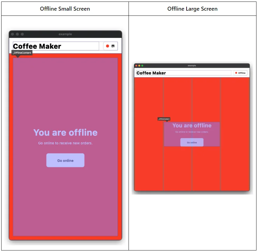
Offline State
WoltScreenWidthAdaptiveWidget enables the StoreOfflineContent widget to seamlessly adapt its centered content to different screen sizes. For small screen widths, the centered content takes up the entire available space with fixed padding. On larger screens, the same content is centered using WoltResponsiveLayoutGrid.centered. We have the flexibility to easily center the content and customize the horizontal positioning and spacing on large screens by specifying the number of columns for the centered content and spacing on each side.
1 2 3 4 5 6 7 8 9 10 11 12 13 14 15 16 17 18 19 20 21 22 23 24 25 26 27 28 29 30 31 32@override Widget build(BuildContext context) { final content = _OfflineContent(isStoreOnlineNotifier: widget._isStoreOnlineNotifier); return Scaffold( body: SafeArea( child: Column( children: [ TopBar(isStoreOnlineNotifier: widget._isStoreOnlineNotifier), Expanded( child: ColoredBox( color: DemoAppColors.red, child: WoltScreenWidthAdaptiveWidget( smallScreenWidthChild: SizedBox.expand( child: Padding( padding: const EdgeInsets.all(16.0), child: content, ), ), largeScreenWidthChild: WoltResponsiveLayoutGrid.centered( child: content, centerWidgetColumnCount: 2, paddedColumnCountPerSide: 1, isOverlayVisible: _isOverlayVisible, ), ), ), ), ], ), ), ); }
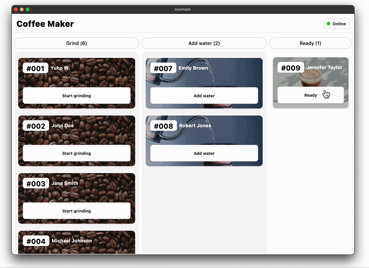
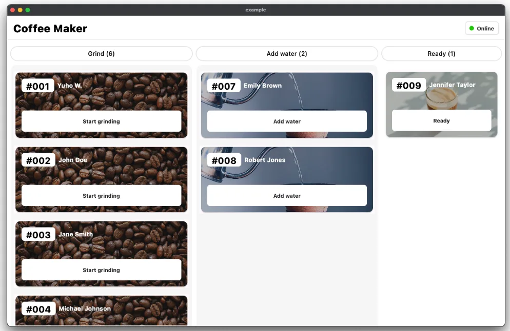
Online State
In the online state, the UI represents the different coffee-making steps, including “grind”, “add water”, and “ready”. Each step is visually represented by a list of coffee orders specific to that step.
1 2 3 4 5 6 7 8 9 10 11 12 13 14 15 16 17 18 19 20 21 22 23 24 25 26 27 28 29 30 31 32 33 34 35 36 37 38 39 40 41 42 43 44 45 46 47 48 49 50 51 52 53 54 55 56 57 58 59 60 61 62 63 64 65 66 67 68 69 70 71 72 73 74 75typedef OnCoffeeOrderStatusChange = Function(String coffeeOrderId, [CoffeeMakerStep? newStep]); class StoreOnlineContent extends StatefulWidget { const StoreOnlineContent({ required GroupedCoffeeOrders groupedCoffeeOrders, required ValueNotifier<bool> isStoreOnlineNotifier, super.key, }) : _isStoreOnlineNotifier = isStoreOnlineNotifier, _groupedCoffeeOrders = groupedCoffeeOrders; final GroupedCoffeeOrders _groupedCoffeeOrders; final ValueNotifier<bool> _isStoreOnlineNotifier; @override State<StoreOnlineContent> createState() => _StoreOnlineContentState(); } class _StoreOnlineContentState extends State<StoreOnlineContent> { late GroupedCoffeeOrders _orders; initState() { super.initState(); _orders = widget._groupedCoffeeOrders; } Map<CoffeeMakerStep, CoffeeOrderListWidget> get _coffeeMakerStepListWidgets => { CoffeeMakerStep.grind: CoffeeOrderListWidget( coffeeOrders: _orders.grindStateOrders, coffeeMakerStep: CoffeeMakerStep.grind, onCoffeeOrderSelected: (coffeeOrderId) { _onCoffeeOrderStatusChange(coffeeOrderId, CoffeeMakerStep.addWater); }, ), CoffeeMakerStep.addWater: CoffeeOrderListWidget( coffeeOrders: _orders.addWaterStateOrders, coffeeMakerStep: CoffeeMakerStep.addWater, onCoffeeOrderSelected: (coffeeOrderId) { _onCoffeeOrderStatusChange(coffeeOrderId, CoffeeMakerStep.ready); }, ), CoffeeMakerStep.ready: CoffeeOrderListWidget( coffeeOrders: _orders.readyStateOrders, coffeeMakerStep: CoffeeMakerStep.ready, onCoffeeOrderSelected: _onCoffeeOrderStatusChange, ), }; @override Widget build(BuildContext context) { return WoltScreenWidthAdaptiveWidget( smallScreenWidthChild: SmallScreenOnlineContent( isStoreOnlineNotifier: widget._isStoreOnlineNotifier, coffeeMakerStepListWidgets: _coffeeMakerStepListWidgets, groupedCoffeeOrders: _orders, ), largeScreenWidthChild: LargeScreenOnlineContent( isStoreOnlineNotifier: widget._isStoreOnlineNotifier, coffeeMakerStepListWidgets: _coffeeMakerStepListWidgets, ), ); } void _onCoffeeOrderStatusChange(String coffeeOrderId, [CoffeeMakerStep? newStep]) { final currentList = List<CoffeeOrder>.from(_orders.allOrders); final updateIndex = currentList.indexWhere((o) => o.id == coffeeOrderId); if ([CoffeeMakerStep.addWater, CoffeeMakerStep.ready].contains(newStep)) { currentList[updateIndex] = currentList[updateIndex].copyWith(coffeeMakerStep: newStep); } else { currentList.removeAt(updateIndex); } setState(() { _orders = GroupedCoffeeOrders.fromCoffeeOrders(currentList); }); } }
Both the SmallScreenOnlineContent and LargeScreenOnlineContent widgets reuse the same CoffeeOrderListWidget to display the coffee order lists for different steps of the coffee-making process. This reuse of widgets promotes code maintainability and reduces duplication, as the same list widget can be used across different screen sizes.
The coffee order status changes, such as advancing an order to the next step in the coffee-making process, are efficiently handled within this widget. This centralized approach simplifies the state handling and guarantees a smooth and reliable user experience regardless of the screen width.
Small Screen Online State
The SmallScreenOnlineContent widget optimizes the user experience on small screens by utilizing a bottom navigation bar for navigation. With a map of CoffeeMakerStep to CoffeeOrderListWidget as input, this widget efficiently manages the display of coffee order lists for each step of the coffee-making process.
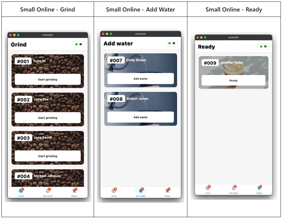
The user interface of SmallScreenOnlineContent consists of a TopBar and a Container. The TopBar dynamically adjusts its title based on the currently selected step, offering clear navigation cues to guide the user through the app. The Container houses the coffee order list for the selected step, utilizing the available screen width and applying horizontal padding.
To facilitate navigation and step selection, this widget has a bottom navigation bar that is responsible for displaying the orders according to the coffee-making steps and allows users to switch between different steps with a single tap. Upon selecting a step, the widget triggers a state update, refreshing the UI to present the corresponding coffee order list.
1 2 3 4 5 6 7 8 9 10 11 12 13 14 15 16 17 18 19 20 21 22 23 24 25 26 27 28 29 30 31 32 33 34 35 36 37 38 39 40 41 42 43 44 45 46 47 48 49 50 51 52 53 54 55 56 57 58 59 60class SmallScreenOnlineContent extends StatefulWidget { const SmallScreenOnlineContent({ required Map<CoffeeMakerStep, CoffeeOrderListWidget> coffeeMakerStepListWidgets, required ValueNotifier<bool> isStoreOnlineNotifier, required GroupedCoffeeOrders groupedCoffeeOrders, super.key, }) : _groupedCoffeeOrders = groupedCoffeeOrders, _coffeeMakerStepListWidgets = coffeeMakerStepListWidgets, _isStoreOnlineNotifier = isStoreOnlineNotifier; final ValueNotifier<bool> _isStoreOnlineNotifier; final Map<CoffeeMakerStep, CoffeeOrderListWidget> _coffeeMakerStepListWidgets; final GroupedCoffeeOrders _groupedCoffeeOrders; @override State<SmallScreenOnlineContent> createState() => _SmallScreenOnlineContentState(); } class _SmallScreenOnlineContentState extends State<SmallScreenOnlineContent> { late CoffeeMakerStep _selectedStepForBottomNavigationBar; initState() { super.initState(); _selectedStepForBottomNavigationBar = CoffeeMakerStep.grind; } @override Widget build(BuildContext context) { return Scaffold( body: SafeArea( child: Column( children: [ TopBar( selectedStepForBottomNavigationBar: _selectedStepForBottomNavigationBar, isStoreOnlineNotifier: widget._isStoreOnlineNotifier, ), Expanded( child: Container( width: double.infinity, height: double.infinity, padding: EdgeInsets.symmetric(horizontal: 16), color: DemoAppColors.black4, child: widget._coffeeMakerStepListWidgets[_selectedStepForBottomNavigationBar]!, ), ), ], ), ), bottomNavigationBar: SmallScreenBottomNavigationBar( groupedCoffeeOrders: widget._groupedCoffeeOrders, selectedStep: _selectedStepForBottomNavigationBar, onSelected: (selectedStep) { setState(() { _selectedStepForBottomNavigationBar = selectedStep; }); }, ), ); } }
Large Screen Online State
The LargeScreenOnlineContent widget showcases the effective utilization of screen space by using the WoltResponsiveLayoutGrid package. The grid is composed of multiple WoltColumnSpanCell widgets, each specifying the desired column span and the corresponding columnCellWidget. By defining the column span and assigning the appropriate CoffeeOrderListWidget to each cell, the widget intelligently distributes and displays the coffee order lists across the screen. The margin and gutter parameters provide spacing and alignment control, ensuring a visually balanced composition.
1 2 3 4 5 6 7 8 9 10 11 12 13 14 15 16 17 18 19 20 21 22 23 24 25 26 27 28 29 30 31 32 33 34 35 36 37 38 39 40 41 42Scaffold( body: SafeArea( child: Column( children: [ TopBar(isStoreOnlineNotifier: widget._isStoreOnlineNotifier), Expanded( child: WoltResponsiveLayoutGrid( margin: 8, gutter: 8, isOverlayVisible: _isOverlayVisible, columnSpanCells: [ WoltColumnSpanCell( columnSpan: 3, columnCellWidget: LargeScreenCoffeeOrderListSection( coffeeMakerStep: CoffeeMakerStep.grind, coffeeOrderListWidget: widget._coffeeMakerStepListWidgets[CoffeeMakerStep.grind]!, ), ), WoltColumnSpanCell( columnSpan: 3, columnCellWidget: LargeScreenCoffeeOrderListSection( coffeeMakerStep: CoffeeMakerStep.addWater, coffeeOrderListWidget: widget._coffeeMakerStepListWidgets[CoffeeMakerStep.addWater]!, ), ), WoltColumnSpanCell( columnSpan: 2, columnCellWidget: LargeScreenCoffeeOrderListSection( coffeeMakerStep: CoffeeMakerStep.ready, coffeeOrderListWidget: widget._coffeeMakerStepListWidgets[CoffeeMakerStep.ready]!, ), ), ], ), ), ], ), ), );
Conclusion
This blog post series highlighted the power and versatility of Flutter in building responsive and visually stunning apps. By utilizing the WoltResponsiveLayoutGrid library, the CoffeeMaker demo app demonstrates how to create dynamic and adaptive layouts that adapt seamlessly to different screen sizes. Throughout the development of the CoffeeMaker app, code reuse, and composition were emphasized. The CoffeeOrderListWidget was reused across different screen sizes, promoting code maintainability and reducing duplication. The centralized state management ensured a consistent user experience across small and large screens, simplifying state handling and promoting scalability. Overall, by following the principles and techniques demonstrated in this blog series, developers can create engaging and responsive mobile apps that deliver a great user experience on various devices and screen sizes.
Acknowledgments
Huge kudos to our Product Designer Ege Altunsu, who designed the demo application🚀

This blog post was written with the assistance of ChatGPT, a language model developed by OpenAI. ChatGPT helped in generating code snippets, providing explanations, and assisting with the overall content of the article. Its capabilities as a language model were instrumental in creating this informative blog post.