Tech
Cagatay Ulusoy
Jun 1, 2023
Wolt Responsive Layout Grid: A Solution for Adaptive and Consistent Multi-Platform Layouts

Wolt Responsive Layout Grid library introduces the Flutter implementation of Material Design's responsive layout grid. It is an open-source project that provides a unified, multi-platform grid system that ensures consistency and visual integrity regardless of the device or operating system being used.
In this series of blog posts, we will explore the key features and benefits of this library, along with a showcase demo application. The source code of the library with the example app, can be accessed through this link. The blog post for the example app can be accessed in this link.
Wolt Responsive Layout Grid Library
With the increasing diversity of devices and screen resolutions, it is crucial to design applications that adapt seamlessly to varying screen dimensions. Responsive grid layouts enable developers to create flexible and dynamic UIs that automatically adjust to fit different screen sizes. However, creating responsive grid layouts can be a complex and time-consuming process. With the Wolt Responsive Layout Grid library, solving this problem becomes much simpler. This library enables developers to utilize a proven system rather than starting from scratch by providing an open-source implementation of Material Design's responsive layout grid. It saves development time, reduces complexity, and encourages best practices in creating responsive and visually appealing layouts. Moreover, being an open-source project, it invites collaboration and contributions from the community, allowing for continuous improvement and expansion of the library's capabilities.
Features
The Wolt Responsive Layout Grid library offers the following key features:
Responsive Grid Layout: The
WoltResponsiveLayoutGridwidget enables the creation of responsive grid layouts that adapt to different screen sizes and orientations.Material Design Adaptation: The library implements Material Design's responsive layout grid, guaranteeing consistency and adhering to established design principles.
Customizable Spacing: By adjusting the gutter and margin properties of the
WoltResponsiveLayoutGridwidget, developers have full control over the spacing.Screen Width Adaptation: The
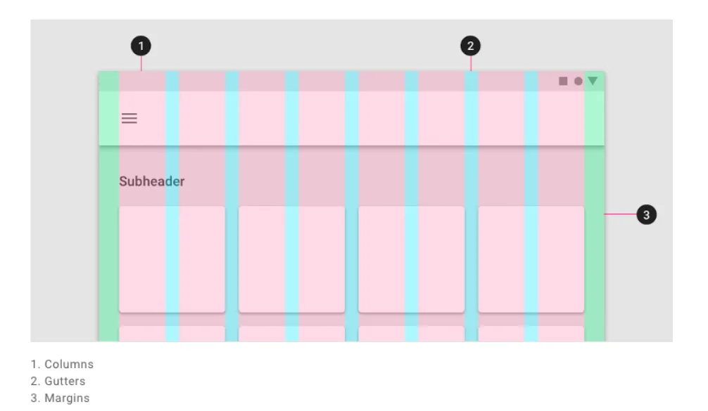
WoltScreenWidthAdaptiveWidgetallows developers to adapt the child widget based on the screen width, dynamically adjusting the layout and content presentation. By providing different child widgets for small and large screens, this widget automatically switches between them based on the screen width, ensuring a seamless user experience across various devices.Overlay for Visual Debugging: During development, it's often helpful to have a visual representation of the grid layout to fine-tune and verify its structure. This library includes an overlay feature that enables you to visualize the grid layout. This overlay renders colored boxes for each column and gutter, making it easier to debug and ensure proper alignment. The overlay can be enabled or disabled based on debugging needs.

Core Components
WoltResponsiveLayoutGrid
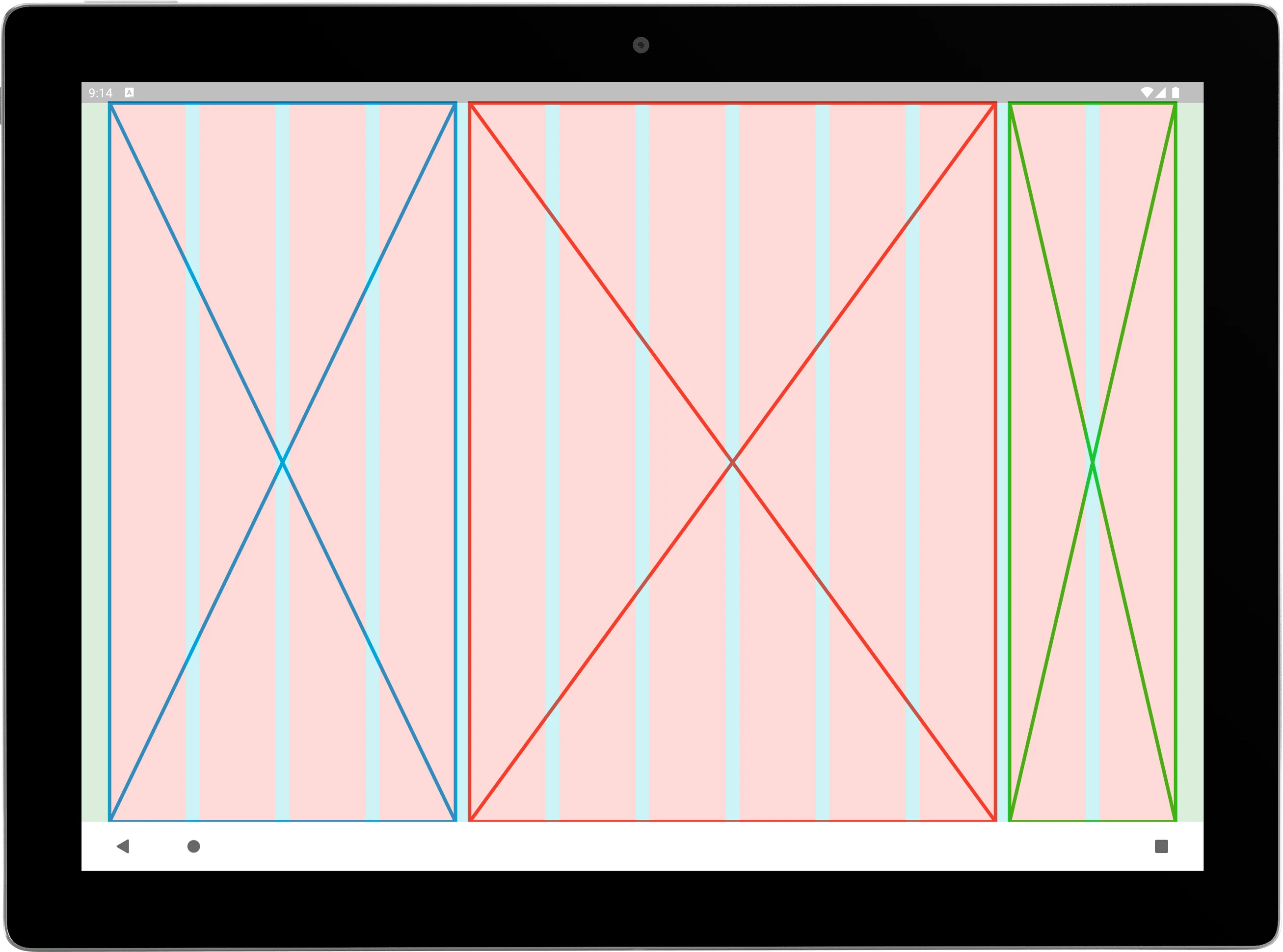
The WoltResponsiveLayoutGrid widget is the centerpiece of the library. By utilizing a list of WoltColumnSpanCell objects, developers can define the content and column spans for each cell. This allows for the grouping of one or more column to create sections or content within the available space.
1 2 3 4 5 6 7 8 9 10 11 12 13 14 15 16 17 18 19WoltResponsiveLayoutGrid( isOverlayVisible: true, gutter: 16, margin: 32, columnSpanCells: [ WoltColumnSpanCell( columnCellWidget: Placeholder(color: DemoAppColors.blue, strokeWidth: 4), columnSpan: 4, ), WoltColumnSpanCell( columnCellWidget: Placeholder(color: DemoAppColors.red, strokeWidth: 4), columnSpan: 6, ), WoltColumnSpanCell( columnCellWidget: Placeholder(color: DemoAppColors.green, strokeWidth: 4), columnSpan: 2, ), ], )
Centered constructor
WoltResponsiveLayoutGrid widget provides a factory constructor centered that simplifies the creation of layouts with a child widget and specified column counts. This constructor takes the following parameters:
child: The child widget to be centered within the grid layout.centerWidgetColumnCount: The number of columns that the child widget should occupy.paddedColumnCountPerSide: The number of padded columns to be added on each side of the child widget. These padded columns create empty spaces around the centered widget, resulting in a visually balanced and appealing layout.
1 2 3 4 5 6 7 8 9 10 11 12 13 14 15 16 17 18 19 20 21 22 23 24 25 26 27 28 29 30factory WoltResponsiveLayoutGrid.centered({ required Widget child, int centerWidgetColumnCount = 2, int paddedColumnCountPerSide = 1, bool isOverlayVisible = false, double gutter = _defaultGutter, double margin = _defaultMargin, Key? key, }) { return WoltResponsiveLayoutGrid( key: key, columnSpanCells: [ WoltColumnSpanCell( columnCellWidget: SizedBox.expand(), columnSpan: paddedColumnCountPerSide, ), WoltColumnSpanCell( columnCellWidget: child, columnSpan: centerWidgetColumnCount, ), WoltColumnSpanCell( columnCellWidget: SizedBox.expand(), columnSpan: paddedColumnCountPerSide, ), ], isOverlayVisible: isOverlayVisible, gutter: gutter, margin: margin, ); }
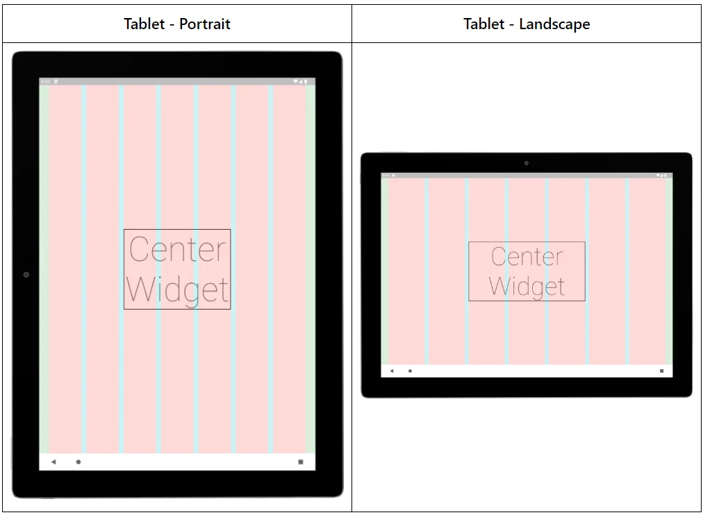
In the example below, a centered layout with a child widget that occupies 3 columns is created. It has 2 padded columns on each side of the child widget to create visual balance and spacing.
1 2 3 4 5 6 7 8 9 10 11 12 13 14 15WoltResponsiveLayoutGrid.centered( centerWidgetColumnCount: 3, paddedColumnCountPerSide: 2, margin: 32, gutter: 16, isOverlayVisible: true, child: DecoratedBox( decoration: BoxDecoration(border: Border.all(color: DemoAppColors.black, width: 2)), child: Text( 'Center Widget', style: Theme.of(context).textTheme.displayLarge, textAlign: TextAlign.center, ), ), ),
WoltScreenWidthAdaptiveWidget
The WoltScreenWidthAdaptiveWidget is designed to provide adaptive rendering based on the screen width. It allows developers to define two child widgets: one for small screens and another for large screens. The widget automatically switches between the child widgets based on the screen width, ensuring that the interface adapts seamlessly to different device sizes.
1 2 3 4 5 6 7 8 9 10 11 12 13 14 15 16 17 18 19 20 21 22class WoltScreenWidthAdaptiveWidget extends StatelessWidget { const WoltScreenWidthAdaptiveWidget({ required this.smallScreenWidthChild, required this.largeScreenWidthChild, this.widthBreakPoint = 768, Key? key, }) : super(key: key); @override Widget build(BuildContext context) { final screenSize = MediaQuery.of(context).size.width < widthBreakPoint ? WoltScreenSize.small : WoltScreenSize.large; switch (screenSize) { case WoltScreenSize.small: return smallScreenWidthChild; case WoltScreenSize.large: return largeScreenWidthChild; } } }
Below is an example that displays either text or an icon in a button depending on the screen width constraint.
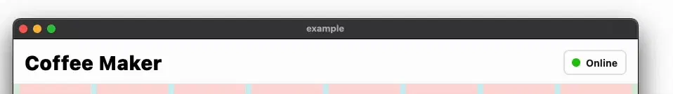
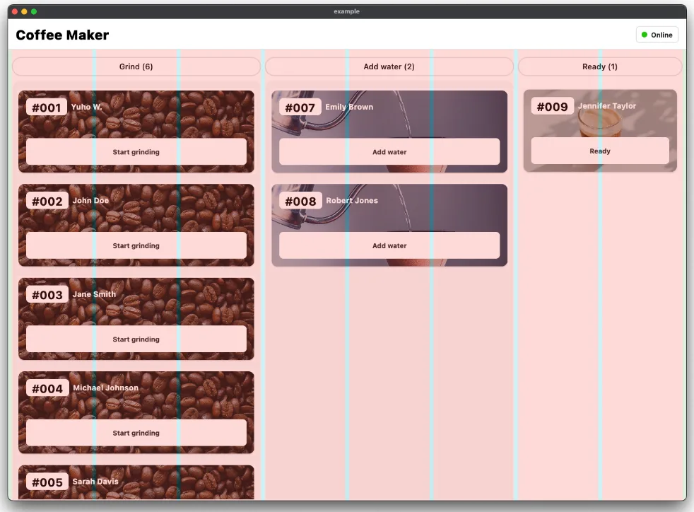
1 2 3 4WoltScreenWidthAdaptiveWidget( smallScreenWidthChild: Icon(Icons.store, size: 16, color: Colors.black), largeScreenWidthChild: Text(isOnline ? 'Online' : 'Offline'), ),
Responsive Layout Calculation Algorithm
One of the key challenges in implementing a responsive layout grid is determining the appropriate column widths and gutter sizes for different screen sizes. The library addresses this challenge with a dynamic layout calculation algorithm. Here's an overview of the algorithm's key steps: Calculating the Total Available Width: The LayoutBuilder widget provides a constraints parameter in the builder function, which represents the available space for the widget. In this case, constraint.maxWidth is used to obtain the total available width for the grid.
1 2 3 4 5 6return LayoutBuilder( builder: (context, constraints) { final totalAvailableWidth = constraints.maxWidth; ... }, )
Determining the Column Width: After determining the total available width for the grid, the algorithm calculates the individual column width. To achieve this, the available width is divided by the total number of columns, taking into account the gutter and margin spacing. This calculation guarantees that all columns have the same width, accommodating different screen sizes and orientations effectively.
1 2 3 4 5 6 7 8 9 10 11double get _totalMarginWidth => margin * 2; int get _totalColumnCount => columnSpanCells.map((e) => e.columnSpan).reduce((a, b) => a + b); double get _totalGutterWidth => (_totalColumnCount - 1) * gutter; double _totalWidthWithoutGutterAndMargin(double totalWidth) => totalWidth - _totalGutterWidth - _totalMarginWidth; double _columnWidth(double totalAvailableWidth) => _totalWidthWithoutGutterAndMargin(totalAvailableWidth) / _totalColumnCount;
Column Span Width Calculation: To accommodate different column spans within the grid, the algorithm calculates the width of each cell's content. This calculation is performed by multiplying the column width by the corresponding column span. Additionally, the gutter width is factored in to ensure appropriate spacing between cells. By considering both the column width and gutter spacing, the algorithm accurately determines the width of each cell's content, ensuring proper alignment and visually pleasing grid layouts.
1 2double _columnSpanWidth(int columnSpan, double columnWidth) => (columnWidth * columnSpan) + (gutter * (columnSpan - 1));
Widget composition: The composition of the responsive grid layout utilizes a Stack widget, featuring two primary components: the main grid layout and an optional overlay for debugging purposes. The main layout begins with a starting side margin and proceeds to iterate through the columnSpanCells list, adding the content of each cell while considering their respective widths. If a cell is not the last one, a gutter is appended to the end. Finally, once all cells are constructed, a final _Margin widget is placed on the ending side of the grid.
Optional overlay: If the isOverlayVisible flag is set to true, a Row widget is created to display the overlay. Within this Row, there are three main components: two _Margin widgets and a loop that constructs the columns and gutters for the overlay without the column span cells
1 2 3 4 5 6 7 8 9 10 11 12 13 14 15 16 17 18 19 20 21 22 23 24 25 26 27 28 29 30 31 32Stack( children: [ Row( children: [ _Margin(margin: margin), for (int i = 0; i < columnSpanCells.length; i++) Row( children: [ SizedBox( width: _columnSpanWidth(columnSpanCells[i].columnSpan, columnWidth), child: columnSpanCells[i].columnCellWidget, ), if (i != _indexOfLastGridContent) _Gutter(gutter: gutter), ], ), _Margin(margin: margin), ], ), if (isOverlayVisible) Row( children: [ _Margin(margin: margin, isOverlay: true), for (int i = 0; i < _totalColumnCount; i++) Row(children: [ _Column(columnWidth: columnWidth, isOverlay: true), if (i != _totalColumnCount - 1) _Gutter(gutter: gutter, isOverlay: true), ]), _Margin(margin: margin, isOverlay: true), ], ), ], )
Conclusion
The Flutter Responsive Layout Grid library offers an intuitive solution for creating responsive grid-based layouts in Flutter applications. With its core components and simple layout calculation algorithm the library simplifies the implementation of adaptive interfaces that seamlessly adapt to varying screen sizes and orientations. By utilizing the provided components, developers can easily define grid layouts that conform to Material Design guidelines.
We encourage developers to explore the Flutter Responsive Layout Grid library and leverage its capabilities to create stunning and user-friendly applications. The provided documentation and demo app serve as valuable resources for getting started.
If this topic sparked your interest, you can find a second blog post about how this library is utilized in the coffeemaker example app via this link.
Acknowledgments
This blog post was written with the assistance of ChatGPT, a language model developed by OpenAI. ChatGPT helped in generating code snippets, providing explanations, and assisting with the overall content of the article. Its capabilities as a language model were instrumental in creating this informative blog post.