Design
Xiaoyu Ji
Dec 9, 2022
Trust and beyond: designing for online retail experience

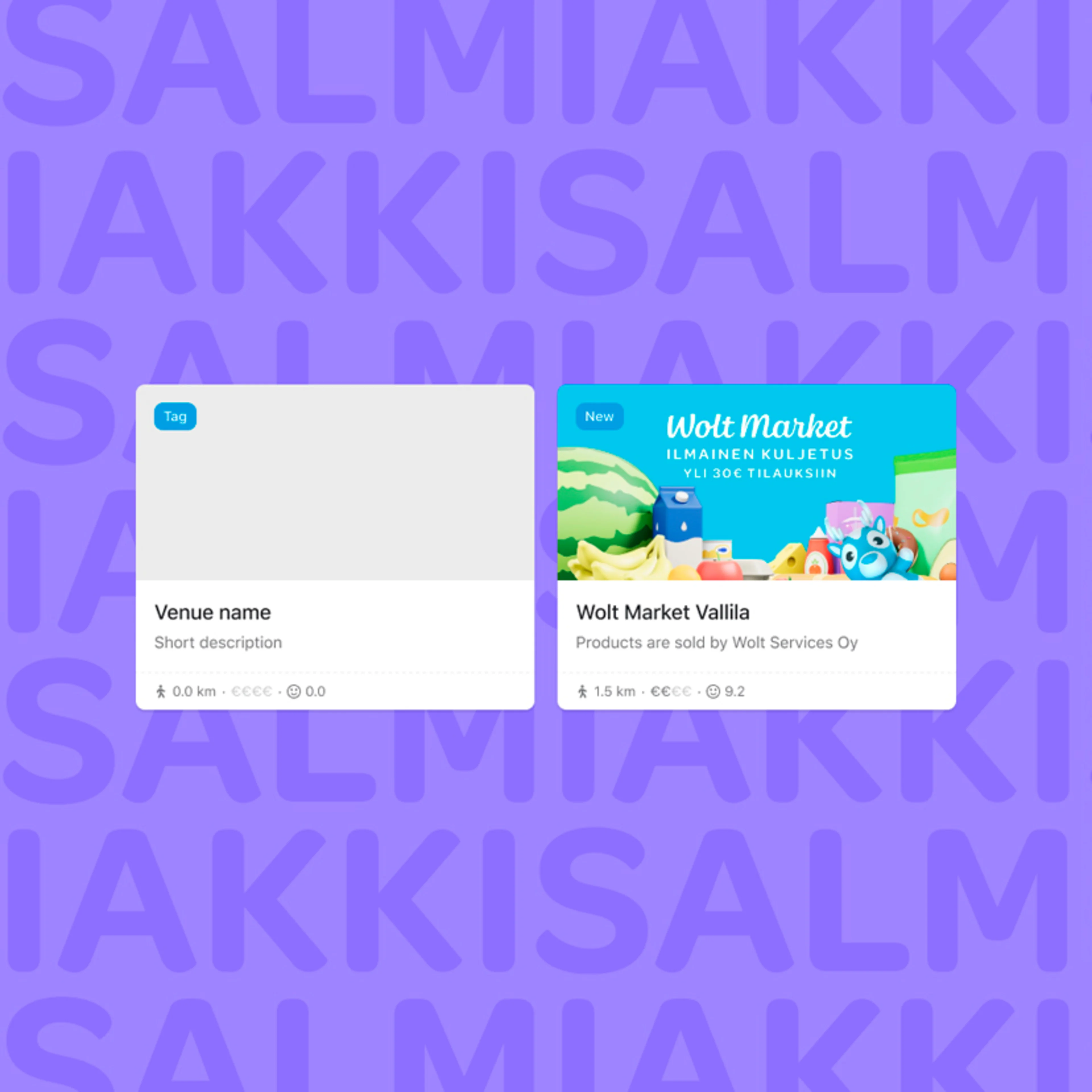
People often ask about the design of our Wolt app and the secret to maintaining high ratings over the years. To provide a glimpse into our design process, here is a case study on how we designed for a retail feature called weight-based items.
The challenge behind selling potatoes by weight online
Imagine you’re buying potatoes. You walk into your favorite grocery shop, pick some potatoes, they get weighed, and you pay according to the weight of the potatoes you picked. It’s a rather natural process.
However, selling potatoes by weight online can be a bit more complex when it comes to presenting and paying for the items. With the introduction of more grocery venues with items that have different prices depending on the exact weight purchased, there were new challenges we needed to dig into. To better understand the challenges associated, we created a service blueprint to map out the full process and identify potential issues for the various parties involved:
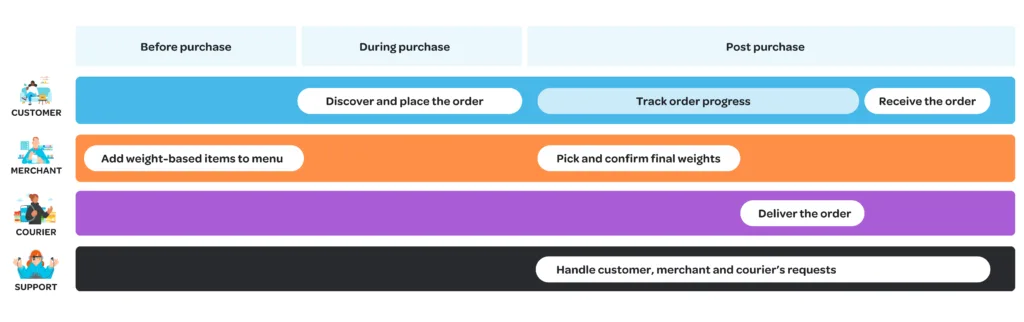
Some obvious challenges were uncovered from the service blueprint:
It’s almost impossible to deliver the exact weight of the product that the customer chooses (imagine the potato example again). Therefore, there needs to be room for weight variations.
This means that the final price of the item may differ from the initial price, requiring the use of card pre-authorization to cover the potential price difference.
Since we cannot promise a fixed price for weight-based items, we must pre-authorize a percentage of the initial price to account for potential weight variations. The final charged price will be recalculated based on the delivered weight.
However, pre-authorizations can remain on a payment card for varying lengths of time depending on the country and bank, so the size of the pre-authorization buffer for weight variations must be carefully considered.
These challenges can complicate the customer experience, merchant menu configurations, picker operations, and payment processes.
Building trust in digital space
We learned from benchmarking that card pre-authorization is a common practice for selling such products online. But allowing a company to do pre-authorization to cover costs you might not know beforehand needs trust. One key challenge in this project was figuring out the ‘whens and hows’ from discovering the products to the checkout and informing customers on the potential weight variations and card pre-authorization. Of course, we also had to comply with legal regulations in all of Wolt’s markets.
At the beginning of a project, there is often not much data to work with, so the design team has to make informed assumptions based on what we believe will create the best experience for our customers. Of course, sometimes our predictions are quite different from how users actually end up behaving in the app. To determine the best approach, we developed five user flows that explored different combinations of ideas and tested how users would respond in the app.
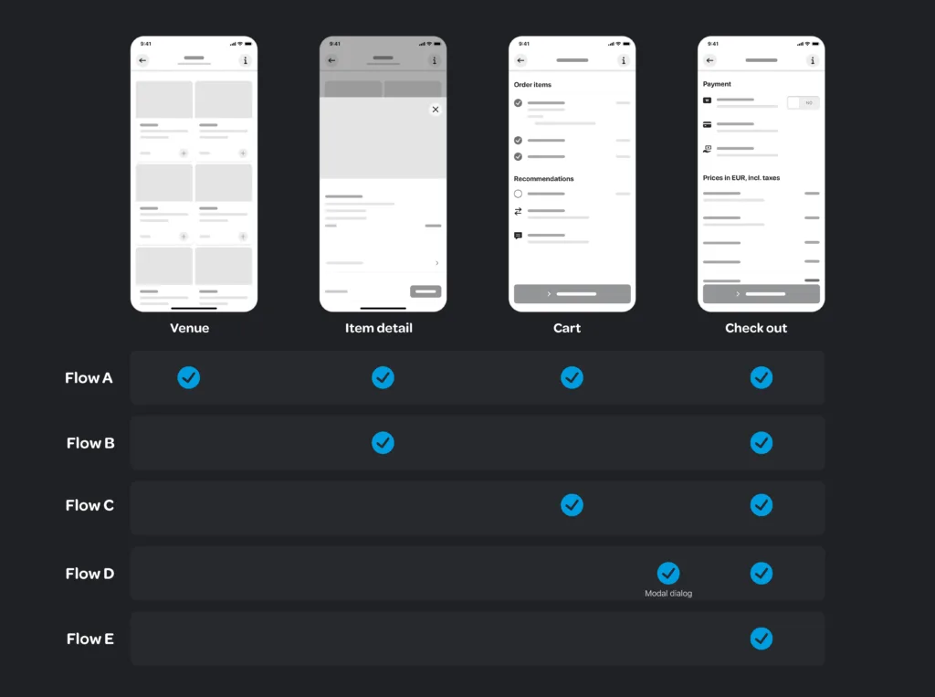
The main difference between the five user flows illustrated above is when the information about card pre-authorization is exposed to customers.
Flow A is the most comprehensive out of the five, while flow E only communicates the information at the final step before purchase. Internally, the team immediately decided that flow E won’t work as the “surprise” at checkout can lead to negative impressions. Flow D didn’t go through either – the idea of showing a modal dialog between cart and checkout screens will interrupt the user flow and leave a friction. The flows A, B and C were tested out with six real users, which helped us understand the following:
The testing results showed that frequent Wolt users carefully look for price-related information at the cart and checkout screens, while ignoring extra information hidden behind an info icon.
Some users who did not discover the pre-authorization information before the checkout screen were surprised and felt that the service was not trustworthy, confirming the team’s prediction about flow E not being the best approach.

Progressive disclosure to approach the simplicity
Based on user feedback, the final proposal was developed with two design principles in mind: transparency to our users by avoiding unwanted surprises, and providing supporting information when needed.
Instead of trying to reduce the amount of information, we decided to provide more information in a progressive disclosure manner.
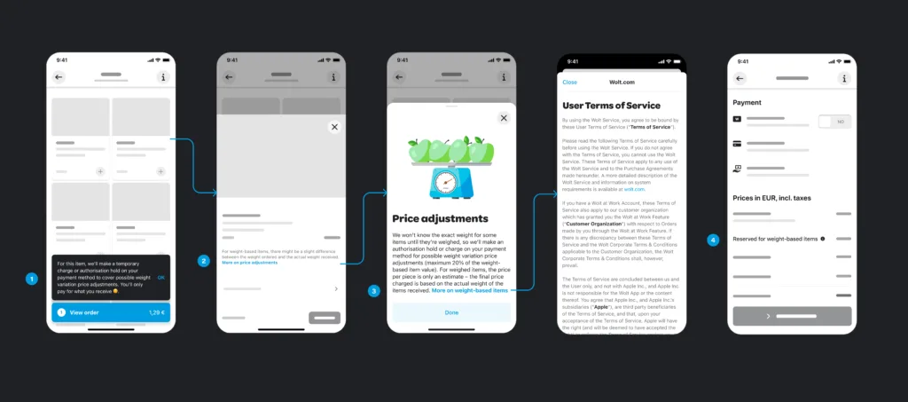
For example, when a user adds potatoes to their cart for the first time, a snackbar with pre-authorisation information appears and requires the user to acknowledge it before continuing.
When the user views the item details, a brief text is displayed under the item description to explain potential weight variations.
A dedicated info view provides additional information about price adjustments and offers the option to view the user terms of service.
Finally, the checkout screen displays the reservation fee for weight variations with additional information hidden behind an info icon.
More than just a legal disclaimer
The design work does not stop here; to make sure we comply with legal requirements, there were lots of internal discussions back and forth between the legal and design teams. We all know legal disclaimers can come with pretty long, and sometimes a bit overwhelming texts for the users. The goal here was to inform the user in-time and keep the tone of voice user-friendly, while communicating complex legal information in a clear and more usable way. Also, on the price adjustment info view, we added an illustration to show the apple and weighing machine as the visual trigger that quickly visualizes the relationships between weight variations and price adjustments.
It is more than just a legal disclaimer that customers see on the consumer app in the end. Beyond this user flow, there are plenty of other interesting challenges we have worked on this very topic. For example, how does our Picker App (now renamed to Merchant App Lite), that pickers use in retail stores, receive information about weight-based items? How are payment flows and invoices dealt with when initial payments might differ for the final price? There are a lot of interesting stories from behind the scenes that we’d love to share, but those would need a whole other blog post.
We hope this case study gave you an interesting glimpse into the world of design at Wolt and the challenges we face when building features for our various apps. We’re hiring designers to our team — if you’re a like-minded designer who’d like to dive into the types of challenges described in this blog post, we’d love to hear from you. Check out our open roles at wolt.com/jobs.