Tech
Francesco Cutolo
Aug 15, 2025
Behind Wolt’s New Icons: Designing a System That Scales
TL;DR: As our products and teams grew, so did the friction with our icon library—duplicate concepts, inconsistent styles, and no clear system for naming or search. So, we rebuilt it.
This blog outlines the process: from auditing and redesigning 550+ icons to automating our icon management infrastructure, building a clear taxonomy, and integrating everything into Wolt’s design system.
Read on to learn more about our design approach.
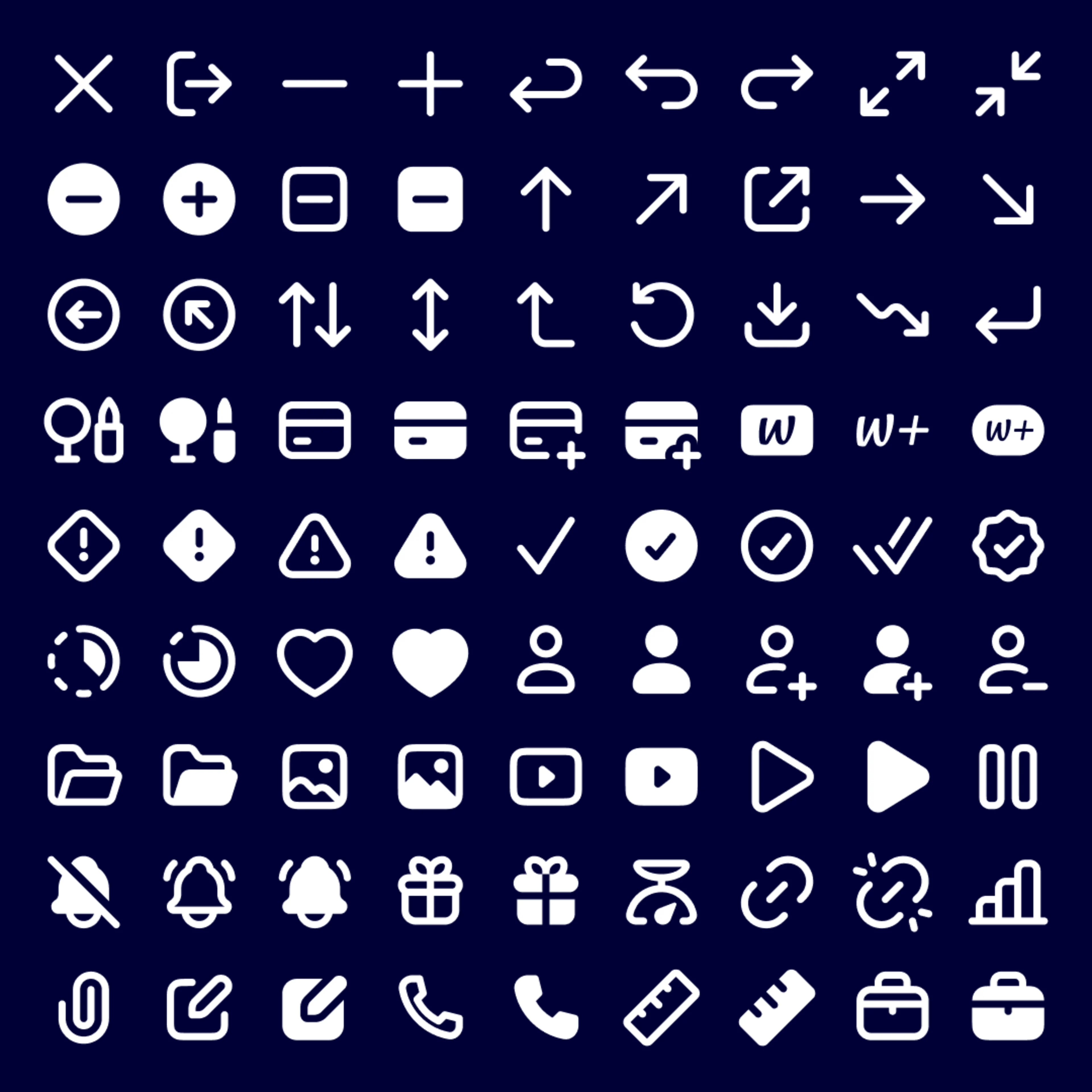
In case you haven’t seen them yet, we’ve rolled out a new, playful look for Wolt’s UI icons, starting with our consumer apps. Check them out and let us know what you think! 👆
Behind the scenes, this was more than a visual refresh. It was a complete system redesign, built to improve workflows and help teams move faster and stay aligned.
Icons are small details, but when your product spans multiple platforms, markets, and teams, they become foundational. They guide navigation, communicate meaning, and create cohesion across experiences. Like many growing design systems, our icon library had grown organically over time. This led to visual inconsistencies, duplication, and slowdowns in both design and development. We knew it was time to reimagine the whole system.
Our Approach: A Systems-Level Redesign
We partnered with Iconists, a team of iconography experts, to help reimagine our approach. Together we audited every icon, mapped usage patterns, consolidated redundant concepts, and re-thought every glyph through the lens of modularity, clarity, and platform consistency. Rather than starting from scratch, we carefully refined and reused elements from Iconists' Central Icons library to retain continuity and save resources.
The Process: How We Rebuilt Our Icon System
To refine our icons, we took a structured, step-by-step approach, ensuring every decision was intentional and well-tested:
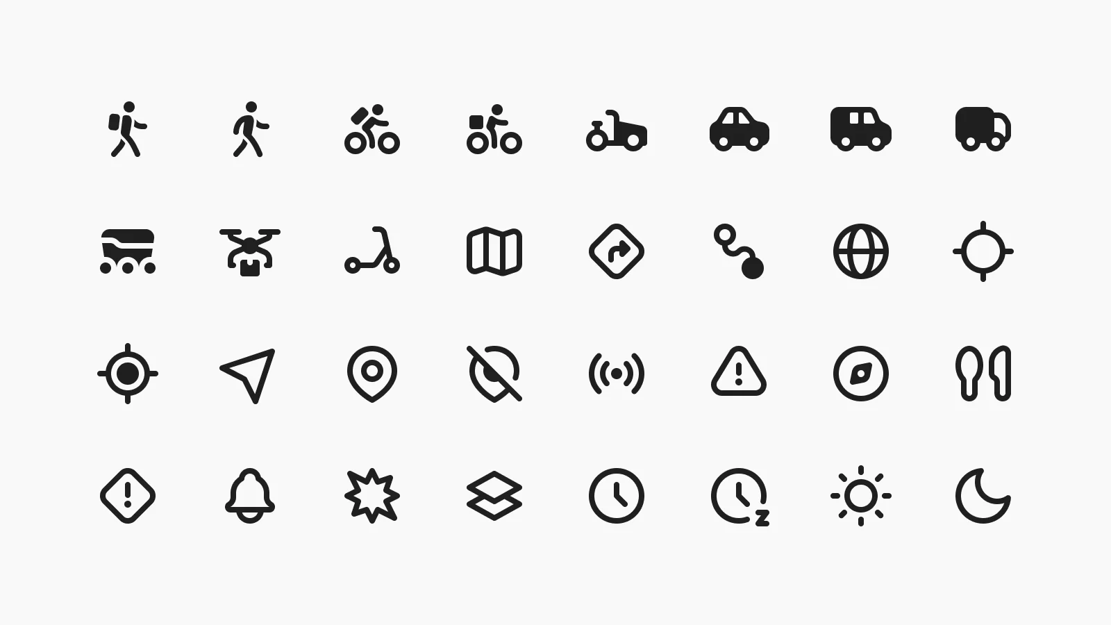
User and accessibility testing: we evaluated how icons performed in different contexts, ensuring they were easily recognisable at various sizes, across light and dark modes, and in different interface layouts.
Grid-based design: by applying strict grid systems and pixel alignment rules, we ensured that icons maintained a sense of uniformity.
Continuous iteration: some icons, like those for pet food and emoji, went through multiple versions to perfect their form, balance, and clarity.
Scalability considerations: we tested how the icons performed at various resolutions to ensure they worked seamlessly across mobile apps, web interfaces, and internal tools.
Production Pipeline
One of the highlights of this project is the automation infrastructure we built around icon management, making the whole system easier to maintain and scale.
Here’s how it works:
Icons live in Figma, which serves as our single source of truth
A custom pipeline exports them into platform-specific formats: SVG for web, PDF and TIFF for iOS, and so on
The outputs are automatically distributed and kept in sync across platforms
This setup ensures that designers and developers always have access to the most up-to-date, accurate assets. It also makes the system future-proof. As new icons are added via our lightweight Slack-to-Jira request workflow, they enter the same pipeline and stay synced. No more outdated folders or versioning nightmares.
Taxonomy & Metadata
Designing the taxonomy and metadata system was one of the more labor-intensive, but most impactful parts of this project. We created a structured naming convention that improves discoverability and makes it easier for teams to find exactly what they need, supporting autocomplete and fuzzy search.
Each icon is tagged across multiple axes:
Function (e.g., “user-management”, “shopping-bag”)
Category (navigation, commerce, media, etc.)
Visual traits (filled, outline, directional, etc.)
Platform behavior, including a critical tag: RTL flipping (by marking which icons should flip in right-to-left interfaces, we’re baking localization and accessibility directly into the system.)
These metadata tags power both our documentation site and Figma libraries, making icons fast and intuitive to find.
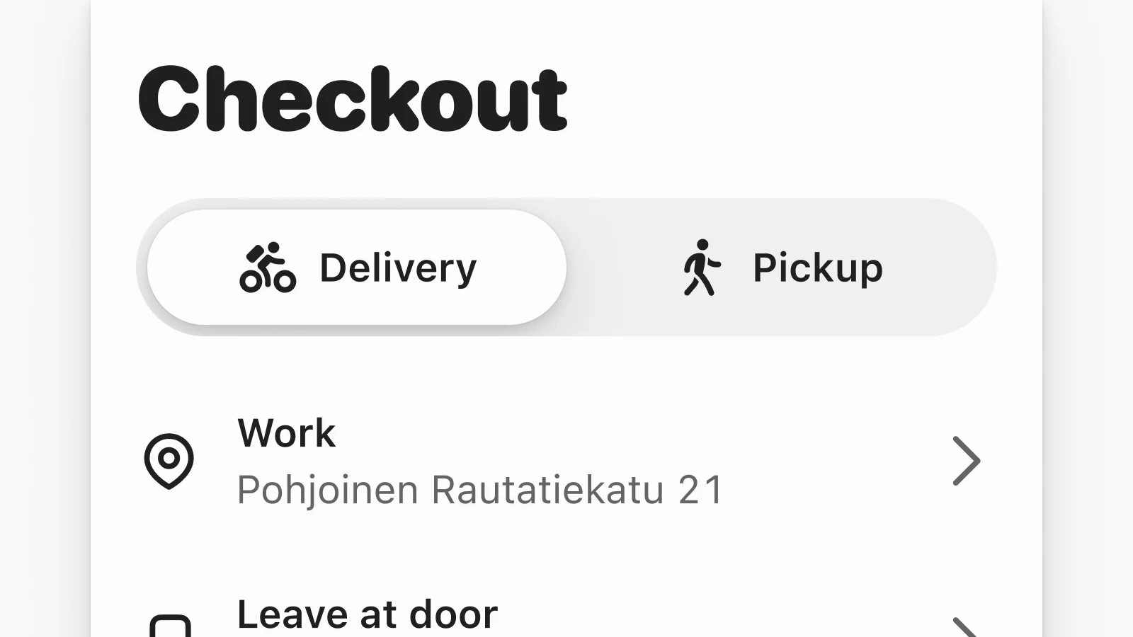
Typographic Pairing
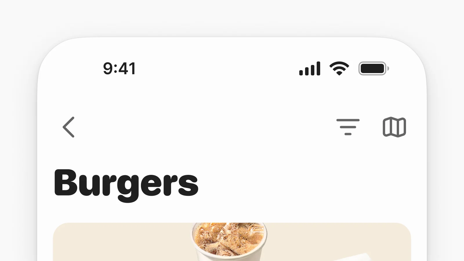
We didn’t stop at icon design. We spent time carefully aligning icon sizes with our core type ramp to ensure beautiful and legible layouts.
12px body text pairs with 16px icon
14px body text pairs with 20px icon
16px body text pairs with 24px icon
This ensures that text and icons feel balanced on every screen, avoiding awkward alignments or visual tension. It also simplifies design decisions by establishing a repeatable, systematized pairing logic.

The Results
The redesigned icon set brought new consistency, clarity, and speed to our workflows, making it easier for teams to build cohesive experiences at scale. Some key outcomes:
550+ redesigned icons, all visually cohesive, optimized for different use cases, and built to scale with Wolt’s evolving needs.
Direct integration with Figma via a custom script, ensuring that the latest icons are easily accessible and reducing friction in the process.
Improved taxonomy and naming conventions, so designers and developers can quickly find and use the right icons.
Seamless adoption in Alchemy, Wolt’s design system, strengthening brand cohesion and making future updates more manageable.
As part of the transition, we ensured that designers had clear documentation, guidelines, and best practices to follow, helping teams quickly adapt to the new system. This made collaboration across teams smooth and more efficient.
What We Learned
This project gave us a chance to experiment, test assumptions, and ultimately build better design infrastructure. One of the biggest takeaways was how to handle cross-platform asset distribution. Each platform had its own format and constraints, but we were committed to a single source of truth. That commitment shaped the automation pipeline which now powers not just icons, but other system-level assets like tokens and components.
We also got to validate our contribution model. Icons were a small, manageable entry point that helped us define a lightweight, repeatable workflow. What started with a Slack-to-Jira flow is now evolving into a foundation for collaborative scaling across the design system.
Lastly, we learned where to focus. Rather than reinventing the wheel, we collaborated with external partners and built on an existing icon library, which let us spend our energy where it really mattered: clarity, precision, and pixel-level craft. It was a reminder that speed and quality aren’t mutually exclusive when the system is working for you.
The Outcome
For designers, developers, and everyone building Wolt products, these updates had a significant impact. Less friction means more time spent for meaningful work.
As we continue to grow, we’ll keep iterating and expanding the icon set through our open request process. But for now, we’re proud to share a system that’s clean, scalable, and truly built for the way Wolt works.


