Tech
Dec 19, 2025
How to build a Custom Overscroll Effect in Jetpack Compose


TL;DR: We built a custom overscroll effect for a screen with LazyColumn in Jetpack Compose by repurposing Modifier.pullRefresh. This approach avoids the complexity of OverscrollEffect or manually implementing NestedScrollConnection, letting us smoothly scale a header image and flatten a curved background using the simple progress value from our modified OverscrollState.
At the consumer Android team, we set out to build a highly polished screen. The non-negotiable feature? A beautiful, interactive image header that stretches and distorts gracefully as the user scrolls past the content boundary, the classic overscroll effect.
Overscroll effects add polish and depth to modern UIs, but Compose doesn’t make them easy to implement. When we started, we hit a familiar roadblock. The built-in OverscrollEffect often proved cumbersome to integrate cleanly with dynamic, lazy layouts such as LazyColumn. The "correct" path, implementing a custom solution using NestedScrollConnection, demanded manually writing and managing complex scroll, drag, and fling logic across multiple override methods. For a simple visual flourish, this felt like overkill:
1 2 3 4 5 6 7 8 9 10 11 12 13 14 15 16 17 18 19 20 21 22 23 24 25 26 27 28 29 30 31 32 33 34 35 36val overscrollOffset = remember { Animatable(0f) } val nestedScrollConnection = remember { object : NestedScrollConnection { override fun onPreScroll(available: Offset, source: NestedScrollSource): Offset { ... } override fun onPostScroll( consumed: Offset, available: Offset, source: NestedScrollSource ): Offset { ... } override suspend fun onPostFling( consumed: Velocity, available: Velocity ): Velocity { ... } } } Box( modifier = Modifier .nestedScroll(nestedScrollConnection) .graphicsLayer { translationY = overscrollOffset.value } ) { LazyColumn { ... } }
We realized we were overcomplicating it. The mechanism we needed was tracking a downward pull and translating that into a progressive visual state, which already existed in our codebase: Modifier.pullRefresh.
While designed solely for the "pull-to-refresh" function, its underlying state management and scroll capture provided the perfect starting point for an overscroll effect limited to the top edge. In this article, we’ll dive into how we creatively repurposed Modifier.pullRefresh to build a simple, robust custom overscroll modifier and craft an interactive, curved header effect.

Creating a curved image header
To start, we’ll need a curved path for the header. The function below defines a quadratic Bezier curve from the bottom left to the bottom right:
1 2 3 4 5 6 7 8 9 10 11 12 13 14 15 16 17 18 19 20 21 22private fun composeCurvedPath( width: Float, height: Float, path: Path, curveRatio: Float = 1f, ) { path.reset() // Move to the bottom left corner path.moveTo(0f, height + 1) // Define a quadratic bezier curve from bottom left to bottom right path.quadraticTo( x1 = width / 2, // Control point X y1 = (height - height * curveRatio), // Control point Y x2 = width + 1, // End point X y2 = height + 1, // End point Y ) // Close the path back to the starting point path.lineTo(0f, height + 1) path.close() }
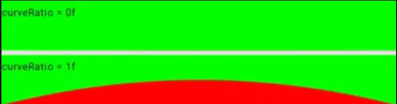
The curveRatio determines the curve’s shape. A value of 1 creates a full curve, while 0 flattens it into a straight line. This path is then used within a CurvedBackground composable, which handles the drawing logic with a solid color:
1 2 3 4 5 6 7 8 9 10 11 12 13 14 15 16 17 18 19 20 21 22 23 24 25 26 27 28 29 30 31 32 33 34 35 36 37 38 39 40/** * This view draws a curved arc * * @param color: the filled color of the curve * @param curveRatio: a ratio of 1 means a complete curve, and a ratio of 0 indicates a flat line */ @Composable private fun CurvedBackground( modifier: Modifier = Modifier, color: Color = MaterialTheme.colorScheme.surface, curveRatio: Float = 1f, ) { Box( modifier = modifier.drawWithCache { val hasValidCurveParams = size.minDimension > 0f if (!hasValidCurveParams) { onDrawWithContent {} } else { val paint = Paint().apply { isAntiAlias = true this.color = color style = PaintingStyle.Fill } val path = Path() composeCurvedPath( width = size.width, height = size.height, path = path, curveRatio = curveRatio, ) onDrawWithContent { drawIntoCanvas { canvas -> canvas.drawPath(path, paint) } } } } ) }
Here is how it looks using a green background color and a red fill color for more visibility, with a curveRatio of 0 and 1, respectively:
This allows us to create a visually appealing curved header by putting the curve at the bottom of an image:
1 2 3 4 5 6 7 8 9 10 11 12 13 14 15 16 17 18 19 20 21 22 23 24 25 26@Composable fun CurvedImage( @DrawableRes imageRes: Int, modifier: Modifier = Modifier, ) { Box( modifier = modifier .background(MaterialTheme.colorScheme.surface) .clipToBounds(), ) { Image( modifier = Modifier.fillMaxWidth(), painter = painterResource(imageRes), contentDescription = null, contentScale = ContentScale.FillWidth, ) CurvedBackground( modifier = Modifier .align(BottomCenter) .fillMaxWidth() .height(50.dp), curveRatio = 1f, ) } }
And here is the result:

Building the custom overscroll modifier
Let’s have a look at Modifier.pullRefresh:
1 2 3 4fun Modifier.pullRefresh( state: PullRefreshState, enabled: Boolean = true ) = pullRefresh(state::onPull, state::onRelease, enabled)
The Modifier.pullRefresh relies on an associated PullRefreshState, which we can simplify into an OverscrollState tailored to our use case:
1 2 3 4 5 6 7 8 9 10 11 12 13 14 15 16 17 18 19 20 21 22 23 24 25 26 27 28 29 30 31 32 33 34 35 36 37 38 39 40 41 42 43 44 45 46 47 48 49 50 51 52 53 54 55 56 57 58 59 60 61 62 63 64 65 66 67 68 69 70 71/** * A state object that can be used in conjunction with [overscroll] to add overscroll * behaviour to a scrollable component. * * Provides [progress], a float representing how far the user has overscrolled as a percentage * of the [threshold]. Also provides the over-scrolled [offset]. * * Should be created using [rememberOverscrollState]. */ @Stable class OverscrollState internal constructor( private val animationScope: CoroutineScope, private val threshold: Float, ) { private val offset get() = position val progress get() = position / threshold private var position by mutableFloatStateOf(0f) private var distancePulled by mutableFloatStateOf(0f) internal fun onPull(pullDelta: Float): Float { val newOffset = (distancePulled + pullDelta).coerceAtLeast(0f) val dragConsumed = newOffset - distancePulled distancePulled = newOffset position = (distancePulled * DRAG_MULTIPLIER).coerceAtMost(threshold) return dragConsumed } internal fun onRelease(velocity: Float): Float { animateIndicatorTo(0f) val consumed = when { // We are flinging without having dragged it down first (for example, a fling inside // a list) - don't consume distancePulled == 0f -> 0f // If the velocity is negative, the fling is upwards, and we don't want to prevent the // the list from scrolling velocity < 0f -> 0f // It's already dragged down, and the fling is downwards - consume everything else -> velocity } distancePulled = 0f return consumed } // Ensure that any existing animations are canceled when we launch a new one. We use this instead of // Animatable as calling snapTo() on every drag delta has a one-frame delay, and some extra // overhead of running through the animation pipeline instead of directly mutating the state. private val mutatorMutex = MutatorMutex() private fun animateIndicatorTo(offset: Float) = animationScope.launch { mutatorMutex.mutate { animate( initialValue = position, targetValue = offset, ) { value, _ -> position = value } } } } internal object OverscrollStateDefaults { /** * This constant controls the friction/speed of the drag (a lower value makes the pull feel heavier) * The distance pulled is multiplied by this value to give us the adjusted distance pulled, * which is used in calculating the offset */ const val DRAG_MULTIPLIER = 0.5f }
Since we only need the progress property, all unrelated logic has been removed. With this simplified state object, we can simply replicate the behavior of Modifier.pullRefresh using our custom OverscrollState instance:
1 2 3 4 5 6 7/** * Adds overscroll behavior to a scrollable component. */ fun Modifier.overscroll( state: OverscrollState, enabled: Boolean = true, ) = pullRefresh(state::onPull, state::onRelease, enabled)
Next, we need to provide a way to create a state object similar to rememberPullRefreshState, but way simpler:
1 2 3 4 5 6 7 8 9 10 11 12 13 14 15 16 17 18 19 20 21 22 23/** * Creates an OverscrollState that is remembered across compositions. */ @Composable fun rememberOverscrollState(): OverscrollState { val scope = rememberCoroutineScope() val thresholdPx = with(LocalDensity.current) { OverscrollStateDefaults.THRESHOLD.toPx() } val state = remember(scope) { OverscrollState( animationScope = scope, threshold = thresholdPx, ) } return state } internal object OverscrollStateDefaults { /** * The maximum allowed overscroll distance */ val THRESHOLD = 80.dp }
Final touch: Connecting OverscrollState and CurvedImage
The OverscrollState can be simply passed into CurvedImage:
1 2 3 4 5 6 7 8 9 10 11 12 13 14 15 16 17 18 19 20 21 22 23 24 25 26 27 28 29 30 31@Composable fun CurvedImage( @DrawableRes imageRes: Int, overscrollState: OverscrollState = rememberOverscrollState(), modifier: Modifier = Modifier, ) { Box( modifier = modifier .background(MaterialTheme.colorScheme.surface) .clipToBounds(), ) { Image( modifier = Modifier .fillMaxWidth() .graphicsLayer { scaleX = 1 + overscrollState.progress scaleY = 1 + overscrollState.progress }, painter = painterResource(imageRes), contentDescription = null, contentScale = ContentScale.FillWidth, ) CurvedBackground( modifier = Modifier .align(BottomCenter) .fillMaxWidth() .height(50.dp), curveRatio = 1 - overscrollState.progress, ) } }
The overscrollState.progress dynamically scales up the header image during over-scrolling while flattening the curve proportionally.
It’s show time: Integrating the overscroll modifier
With everything in place, we can now apply the custom modifier to a scrollable screen. This approach enables us to implement smooth, responsive overscroll animations with minimal code and without conflicting with Compose’s scroll mechanics.
1 2 3 4 5 6 7 8 9 10 11 12 13 14 15 16 17 18 19 20 21 22 23 24 25 26 27 28 29@Composable fun ScrollableScreen( modifier: Modifier = Modifier, ) { val overscrollState = rememberOverscrollState() Scaffold( modifier = Modifier .overscroll(overscrollState) .fillMaxSize() ) { innerPadding -> LazyColumn(Modifier.padding(innerPadding)) { item { CurvedImage( modifier = modifier.fillMaxWidth(), overscrollState = overscrollState, imageRes = R.drawable.img1, ) } repeat(20) { item { Text( modifier = Modifier.padding(8.dp), text = "Item $it", ) } } } } }


