Tech
Mikhail Miroschnichenko, QA Competence Lead & Mikko Vaha, Engineering Team Lead
Apr 15, 2024
Building great mobile apps: tips and considerations

To build delightful user experiences, our development teams at Wolt need to constantly take into consideration all our different user groups and how they might be using our products. In our Quality Assistance team, our role is to coach our teams and developers on their quality mindset: this means ensuring that everyone in the team deeply understands the product they’re building, how it’s being used, who the customers using the product are, and how to create added value for those customers. One of the topics we’ll cover in this blog is what aspects to take into consideration when building new features. This brings us to the interesting topic of the complex, yet beautiful world of mobile app development. From considerations around the Operating System to performance limits of mobile devices, you’ll gain concrete tips for what to keep in mind when designing, implementing, and testing a new feature on your mobile application. Let’s dive in!
Considerations for building a great mobile app
1. Understand the differences between Operating Systems
Currently, there are two major operating systems for mobile devices: Android and iOS. The key feature of mobile devices and their OS is that consumers get a combination of software and hardware, and they can’t change it. This is a stark contrast with desktop operating systems, where users can change OS versions freely, and add and upgrade both hardware and software.
From the software point of view, Android consists of three parts:
Android OS and Google Services (Huawei devices have Huawei services instead)
Vendor-specific software: User interface and built-in software
User’s set of apps.
When it comes to hardware, Android devices use different sets of built-in sensors, have very different performance, and even different screen technologies. This means that if an app works fine on Device A, it doesn’t mean that it will automatically work flawlessly on Device B. This is because Device B might have very different hardware and come with a different OS version, or the fact that users can replace basic system apps like virtual keyboards, messaging apps, and even user interfaces.
In this regard, iOS devices are easier to work with. There are fewer iOS device models on the market, and most of them work on the latest version of the OS. The set of pre-installed software is nearly the same across all iOS devices, the hardware is powerful and it comes from the same vendor.
It’s impossible to test the app on each device, so we have to pick the device list carefully, to guarantee that the app will work correctly on most devices. To compose a test dives list, you can use:
Market analysis to find out device model distribution, split by countries. For example, from Statista and iOS Ref
Data analytics and science provide us with more detail on the user’s data: telemetry events from our apps, Google Play Console and Google Firebase dashboards, and Apple App Store Connect. From these sources, we can see device models, hardware, countries that the users are from, device language, and the exact number of users for each market.
2. Optimize for the battery life of mobile devices
Mobile devices are designed to work from a battery source as opposed to desktop and laptop machines, which are connected to the power source most of the time. In other words, energy is a finite resource for a mobile device, and it must be used very cautiously. This means special considerations for a developer:
The app uses device processing resources only when it’s needed when the user performs some actions and expects the result.
When the app isn’t being used, it should remain “sleeping”: not using processes, or network connection and not waking the device up.
While transmitting data over the network, the app should issue as few requests as possible and close unused connections.
Animations and screen transitions should render new frames when it’s needed to display an animation. But when a screen is static, there should be no screen redraws.
Any calculations performed on the client side should be well-optimized and use the most suitable hardware. Like running light tasks of low-power processors, and offloading the rendering to specialized hardware (GPU and DSP).
Additionally, check how your app utilizes the processor. Modern mobile processors have several process cores. From low-power and slow cores for simple tasks to high-performance power-hungry cores for the most complex apps. Well-optimized apps should use efficient cores more frequently, and use performance cores when needed only for a short time. You can learn more about heterogeneous architecture on the ARM website.
Let’s look at an example from our Wolt consumer app:
When a user has no orders active in the Wolt app, both the device and the app are “idle”: there’s no process activity (in addition to OS background tasks), and no network activity between the Wolt app and Wolt backend services. This state is the “baseline”.
When a user places an order, a restaurant accepts it, and the user waits for their order to be delivered, there are several new tasks for the device: be in touch with the backend to receive updates about the courier partner’s location and display order information to the user in the app.
Developers can measure how much energy is consumed per unit of time and compare it with the “baseline”. Then, to look for network activity: there’s no need to update the order state every 1/10 of a second. This is a light request, but it still requires a device to send data over the air, receive it, and parse it. All of these consume energy. Next is displaying order info. It should be in sync with updates through the network: the app should redraw the screen when the order state changes. Between changes, there should be no unnecessary screen redraws. After the order is completed, we have to check that power consumption has returned to the baseline.

In the image above, we start with defining a baseline energy consumption, when no apps are running. While starting a new app, energy consumption rises a lot. After the app has started and downloaded all the needed data, energy consumption should drop close to the baseline. Creating a new order will require more processing again. But once the order is sent, there should be no heavy tasks: just playing simple animation and updating the timer on the screen.
Any fluctuations in the new version from the red line that exceed the limits of error might indicate a possible issue. Large deviation from the base line is a reason to investigate what was changed or broken there: a not closed network connection, uncompleted tasks from the previous screen.
3. Prepare your app for connection quality and stability issues
Another important feature to consider when building a great product is radio interfaces. Mobile devices connect to the world with various radio interfaces like WiFi and cellular networks. Wifi has two frequencies (legacy 2.4 GHz and modern 5 GHz) and several standards: g, n, e, and so forth. Cellular networks have several generations: from 2G to 5G. All connection types share the same problem: connection quality and stability.
This makes mobile connectivity different from broadband and cable connections because:
The connection quality often changes throughout sessions. Especially when the device is used on the go, and it switches network connection from one base transmitting station to another one.
A connection might be dropped suddenly and then restored: let’s say for example when you enter the elevator and lose connection for a while.
Signal has higher latency: for real-time applications like multiplayer games this means your action will need more time to reach the server, or fewer consecutive actions can be sent within one period of time.
Higher energy consumption when transmitting a lot of data over the air. A fast 5G network connection uses more energy than WiFi. The greater the distance between the station and the phone, the higher the energy consumption.
What does this mean in practice for mobile app development? Here are some considerations you should keep in mind:
Optimize data transmission to have less time on the line and as few requests as possible. For example, our Wolt Consumer app doesn’t need to download the restaurant menu five times per second. Instead of 10 requests for restaurant data nearby, it can be transmitted with a single request: it will be 10x times bigger, but it will have only one connection request.
Use connection only when it’s needed. When it’s not used, terminate the server connection and let the device put the network module to sleep.
Be ready for situations when a connection is lost while transmitting data, and how to restore operation when a device is back online
Be ready for a slow connection with data losses. Don’t expect that each user can easily transfer 100Mb of data, or run 100 requests for 100 restaurants just in a second (this is just an example, the Wolt app can do it with a single and highly packed request)
4. Keep in mind the added complexity of the touch interface
On a laptop, you use a mouse pointer. On your phone, you use your finger. Mobile devices bring an extra layer of complexity due to more possible interactions with the device including:
Low precision for a pointer location
Possibility to register more than one touch (point)
Two screen orientations: landscape and portrait orientation
Presenting content on a single vertical screen
Mobile screens can have the same resolution as laptops or desktops, but their size is much smaller. In other words, you can’t use the same principles of building a desktop interface for mobile applications. Simply because the same elements on the mobile screen will not be visible or easily accessible. Let’s look at these interactions one by one below, to better understand how the touch interface affects the user experience.
Low pointer precision
The desktop interface has a lot of small elements on the screen. But if you display the same screen on a smaller mobile display, you can’t tap the element you want to: your finger will cover several elements at once. The solution? Make the screen element bigger and reorganize the screen layout at the same time.
Let’s open the Wolt website on a smartphone to select the city as a user on the platform:

With small changes of re-organizing and resizing the content, you can help create a more optimal experience for the user on a smaller device.
Multi-touch
Multi-touch means that the device can register and respond to more than one tap on the screen. It extends what we can do on the mobile device - pinch-to-zoom is a great example gesture of this! But on the other hand, this also means that users can select several actionable buttons simultaneously. This could break the app’s logic if it’s not taken into account when building new features and testing the app.
Let’s take an example: A confirmation dialog with two buttons “OK” and “Cancel”. On the desktop, the user can click a single button at once. But on the mobile device, the user can touch both buttons at the same moment. What will happen then: will a file be deleted or not?
In such a situation, if a second touch can break the app logic, reacting to more than one touchpoint should be disabled. Or, instead, app behavior should be designed and implemented explicitly, without relying on an OS.
Screen orientation
Users can rotate the device at any time to have more height or width. The application must correctly reorganize the elements’ layout and, at the same time, preserve interface logic.
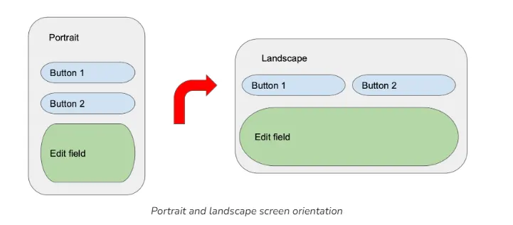
In the example above, the screen layout is changed on the screen rotation to get the use of increased screen width. From the technical point of view, it means that having one screen layout isn’t enough. Instead, the screen layout should be “adaptive” to various screen types:
Screen diagonal and proportions require different element layouts (as in the example above)
Screen resolutions and pixel density (“dots per inch”) affect how small elements or ones with a lot of details (like images) will be displayed. Therefore, there should be different sets of graphical elements in the app.
Phones have different positions and sizes of front-facing cameras: from a small hole at the corner to a big dynamic island on iPhones. This requires elements near the edge of the screen to be moved to be fully visible.
“Endless” scrolling
A lot of mobile apps allow users to scroll the screen almost endlessly. Desktop apps tend to display content within a single screen.
Take the Wolt Consumer app as an example. Users can scroll the “Discovery” screen vertically, to see more categories or scroll through a specific category horizontally.
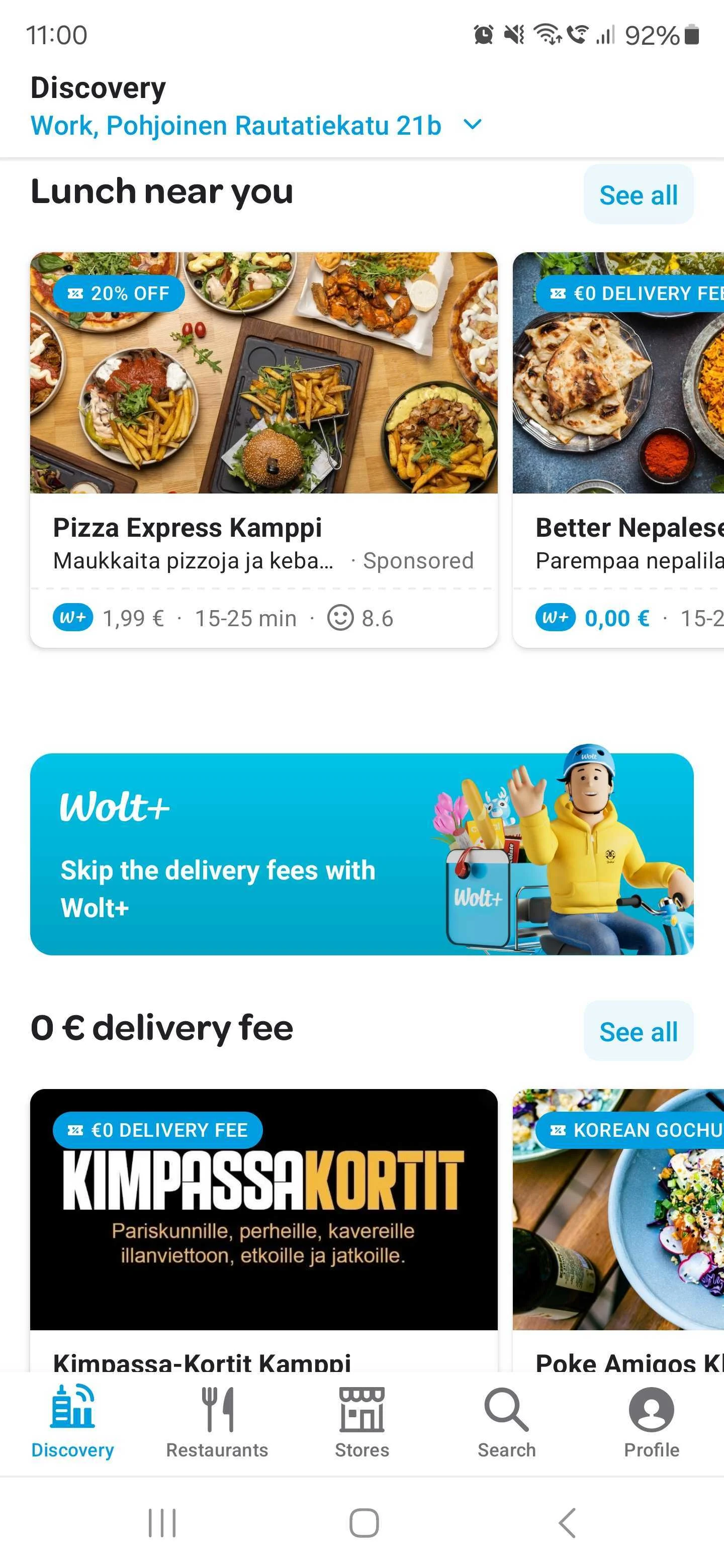
From the developers’ point of view, for the discovery page to work seamlessly, they have to:
Implement “pagination”: as it’s impossible to load endless data from the backend, the app should load it in smaller chunks, just to display content for the next “scroll”.
Implement memory management: allocating and freeing memory when an element is shown on the screen, and when it moves outside the screen’s visible area.
5. Consider the performance limits of different mobile devices
Top-tier mobile devices like Apple iPhones and Samsung S-series have very high performance, while most Android devices are much less powerful. Therefore, your app should be well-optimized to avoid complex, long calculations on the client.
Displaying a graphical user interface is quite a heavy task. The app interface should be simpler compared to desktop and web apps, with fewer elements and screens shown at the same time. When the screen with all its elements is too “heavy”, it can lead to “freezes”, dropped frames, and slower responses to user actions (like pressing buttons or entering text).
Another important topic is memory management on a mobile device. An app working on a desktop operating system will consume memory when in use. When closing the app, used memory will be freed, or put to the system swap file. Meanwhile, an app on the mobile operating system in most cases has no “close” functionality — it remains in memory as long as possible.
It’s better to keep an app in the memory and let users return to it instantly when needed, without waiting for the app to start up and consume a lot of energy for that. But this mechanism of having all apps in the memory leads to a drastic difference from a non-mobile operating system. When the user starts a new app, and when the memory is full with previously used apps, the operating system has to terminate one of those apps in the memory to free space for a new app. As a result, the developer should ensure that:
When the app is terminated, no user data should be lost
If the app is designed to be running in the background all the time, it should be able to restart itself after an unexpected termination
Different devices could have different memory management systems with strict rules for the app in the background. When building an app, one should keep in mind that user’s device can:
Terminate the app if it was in the background for more than a specific amount of time
Put the app, which has not been used for some time, into a deep sleep, preventing it from automatically starting or performing any activities
Limit incoming connections and notifications sent for the app in the background
A great mobile app should handle all these cases and provide the same functionality, and smooth experience regardless of device model.
6. Remember that a user’s session can be interrupted at any time
Various events can interrupt a session with the app. For example:
Answering an incoming phone call
Switching to a messaging app to reply to a new message
Turning off the device screen
Losing network connection
Receiving a pop-up notification from another app or the operating system
Turning off the device, intentionally or by running out of battery
The app should be able to put its processes “on pause” at any moment and then seamlessly continue working as before. However, the user might not return to the app after an interruption, and after some time the app process will be terminated by the OS to free memory. The app should save important user data from time to time when going to the background and restore it when starting a new session.
Final thoughts 🚀
When building any product, it’s essential – regardless of the user or the interface they’re using – that your users always have a consistently great user experience. I hope this blog post provided you with some useful tips and considerations for what to keep in mind when building your app for mobile.
The main takeaways from this blog are:
Every action on the mobile device consumes energy. The fewer actions the app should execute to complete the user’s task, the less time is needed to act, and the better the battery life. Optimizing and simplifying app code is much more important for the mobile app than for the desktop one.
There are a lot of unpredicted events affecting a user’s interaction with the app - from losing a network connection to low processing power. An app needs to be stable in most conditions and be ready to recover from unexpected situations. Find performance bottlenecks, locate the functions sensitive to interruptions and instability – then optimize your code to handle these situations and test the app on real devices in real environments.
It’s important to remember that mobile apps work on screens of different sizes and they work on a touch interface. Make sure to use mobile interface guidelines from Apple and Google and design your user interface accordingly.
Remember these items when you design, build, and test your mobile app to make your users happy!